Visualizing High Dimensional Data: Blob Analysis + PCA
Datasets
The following code snippets were written as an exercise in visualizing high dimensional data. The datasets used are fairly standard/well known datasets.
- The iris dataset hosted by UC Irvine machine learning data repository at https://archive.ics.uci.edu/ml/datasets/Iris
- The wine dataset hosted by UC Irvine machine learning data repository at https://archive.ics.uci.edu/ml/datasets/Wine
- The breast cancer diagnostic dataset hosted by UC Irvine machine learning data repository at http://archive.ics.uci.edu/ml/datasets/Breast+Cancer+Wisconsin+(Diagnostic)
Scatterplot Matrices
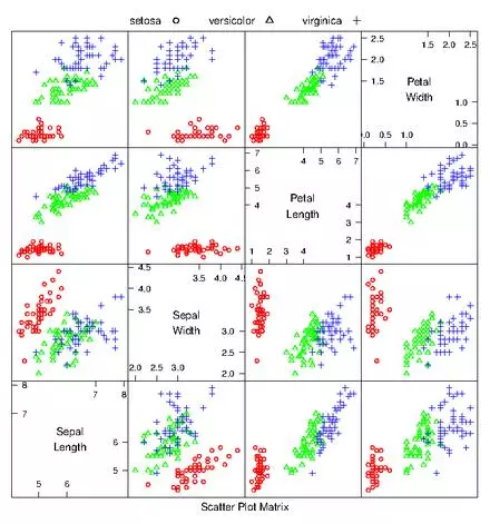
If there aren’t too many dimensions to the data, it can be useful to generate a scatterplot matrix to quickly detect correlations between pairs of variables. A scatterplot matrix is simply a matrix of scatterplots for every pair of dimensions. For example, the iris dataset only has 4 features (dimensions). This can easily be viewed in a 16 cell matrix. From the scatterplot matrix its easy to see that each species clusters quite nicely, and different from one another. Be careful with scatterplot matrices and units. If you don’t normalize the coordinates and say for example one variable is reported in km while another is given in cm… you can miss important information.
irisdat <- read.csv("iris.data.txt",header=F);

#get numeric columns only
numiris=irisdat[,c(1,2,3,4)]
iris.lab = irisdat[,c(5)]

#open new eps file
postscript("irisscatterplot.eps")

speciesnames<- c('setosa','versicolor','virginica')

#point type for each type of flower
pchr<- c(1,2,3)
#colors for plot
colr<- c('red','green','blue','yellow','orange')

#create a dataframe with factor column "species", three rows 1 to 3
ss<- expand.grid(species=1:3)


parset<- with(ss,simpleTheme(pch=pchr[species],
                            col=colr[species]))

splom(irisdat[,c(1:4)],groups=irisdat$V5,
      par.settings=parset,
      varnames=c('Sepal\nLength','Sepal\nWidth',
                  'Petal\nLength','Petal\nWidth'),
      key=list(text=list(speciesnames),
               points=list(pch=pchr),columns=3))
dev.off()
Blob Analysis and Transforms for High Dimensional Data
In general, mean and covariance help form a good description of data that resides in a “blob”, because together they yield a coordinate system useful when interpreting the blob. If data forms multiple blobs, the mean and covariance are less helpful. Luckily, a lot of datasets are basically single blobs… and so long as the appropriate coordinate transformations are applied, a blob can be easily interpreted.
Necessary coordinate transformations often involve mean shifting a blob so that it resides around the origin where the mean will be 0. Shifting a blob like this won’t change scatterplots in a meaningful way, apart from changing the axes values. Rotating a blob however, can cause large changes. If vertical and horizontal components of the data are correlated, then the blob lies somewhat diagonally. If this is the case, then the blob can be rotated so that there is no correlation between these components (such that the axes of the blob align with coordinate axes). Mathematically, this is a rotation which diagonalizes the covariance matrix. At this point, the components don’t translate to variables directly, instead they are linear combinations of the original components. But the new components are special… there is no correlation between any pair of new components.
Any blob can then be reduced to a “standard blob” by simply stretching/scaling such that all variances are one. This is called “Whitening the data”.
PCA
High dimensional datasets can prove difficult to work with, especially if its unclear which variables are important. However, often a high dimensional dataset is really just a lower dimensional dataset masquerading as a high dimensional dataset. Sometimes only a few variables of the many included in the data are responsible for much if any meaningful variation. It would be nice if we could hone in on those variables straight away.
First remember that the data could be transformed, and use that to define a coordinate system within the blob whose origin is the data’s mean and whose coordinate axes are given by eigenvectors of the covariance matrix. Then, in this “blob coordinate system” look for variations in the data. Perhaps the data is stretched along certain blob axes. The data may look “cigar” shaped in this blob coordinates, such that there is large variation along one axes and not much along the other. This would indicate that the blob component with less variation is somewhat irrelevant compared to the blob component with high variation. One could set all the values for the irrelevant component to 0 and effectively reduce the dimensionality of the data without greatly affecting the position of data in blob coordinates. Ie: turn the 2D cigar into a 1D line. Obviously this is harder to conceptualize in higher dimensions, but the same principle applies.
In blob coordinates however, we run the risk of lost meaning for units. For example, if one original component was a weight and yet another was a length, then a linear combination of those that yielded a new component is difficult to interpret. Ie: distinct meaning and scale of data items is not easily preserved in blob coordinates. The solution? Suppress irrelevant variations in blob coordinates but return to the original coordinates for interpretation. So, instead of dealing in blob coordinates indefinitely, do the following:
- Transform data into blob coordinates
- Compute lower dimensional representation in blob coordinates (remove unnecessary dimensions by zeroing values of data points along components with low variation)
- Transform the new representation into the original coordinate system
The result is a lower dimensional space that preserves the largest variance directions of the original data.
Implementing PCA
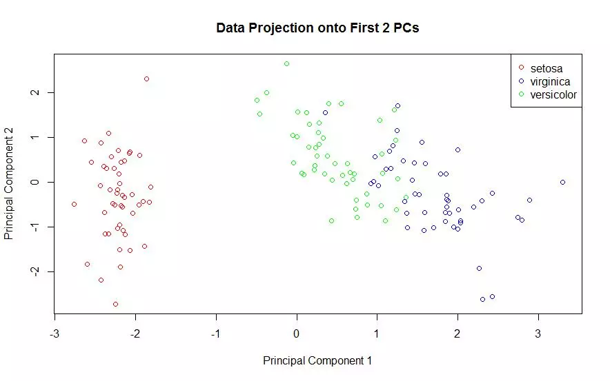
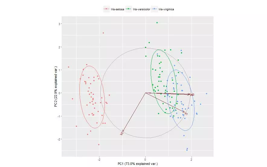
The first two principal components of the iris data were obtained and the data was plotted on those two principal components alone. Each species is shown with a different color marker. This process was done using two different packages and plotted once for each.
#use a package to handle the projection of the data
#onto the first two principal components
iris.pc = princomp(scale(numiris, center=TRUE,scale=TRUE),scores=T)
#plot(iris.pc)
#screeplot(iris.pc,type="lines")

#M = iris.pc$loading[,1:2]  #first two principal components
#t(M) %*% M   #check, make sure this equals the identity (2x2) matrix

#plot the data projected onto the first two principal components
plot(iris.pc$scores[,1],iris.pc$scores[,2],pch=".")

#create the same plot as above, but color the points by their class
#use wine.lab to decide the color for each of the 178 exs
DF <- data.frame(projDataPC1 = iris.pc$scores[,1], projDataPC2 = iris.pc$scores[,2], label = iris.lab);
attach(DF);
plot(projDataPC1, projDataPC2, col=c("red","green","blue")[label], xlab = "Principal Component 1", ylab = "Principal Component 2", main = "Data Projection onto First 2 PCs");
detach(DF);
legend(x ="topright", legend = c('setosa','virginica','versicolor'), col = c("red","blue","green"), pch=1);

#ALTERNATE Package method... (accomplishes the same thing)
log.ir <- log(numiris) #not necessary but can be helpful
ir.species <- irisdat[, 5]

#conduct pca on the z-score (mean center and scale each vector to unit variance)
ir.pca <- prcomp(numiris, center = TRUE, scale. = TRUE)
#can also take the log transform and take the z-score of that
logir.pca <- prcomp(log.ir, center = TRUE, scale. = TRUE)

predict(ir.pca, newdata=numiris)

library(devtools)
#install_github("vqv/ggbiplot")
library(ggbiplot)

g <- ggbiplot(ir.pca, obs.scale = 1, var.scale = 1,
              groups = ir.species, ellipse = TRUE,
              circle = TRUE)
g <- g + scale_color_discrete(name = '')
g <- g + theme(legend.direction = 'horizontal',
               legend.position = 'top')
Discriminative Directions
The curse of dimension is such that as the number of dimensions increases, the majority of the data can lie quite far away from the mean. This is extremely unintuitive as we tend to intuit that most data lies in the volume and not on the surface. Forgetting this curse and following intuition can get one into trouble with PCA however. With high dimensional data it can be very difficult to obtain a covariance matrix… a matrix which PCA relies heavily upon.
It is, however, possible to form principal components without the covariance matrix. SVD (Singular Value Decomposition) can yield all the principal components, and NIPALS (Non-linear Iterative Partial Least Squares) is a faster iterative process useful in recovering the first few principal components when not all components are needed. But both these options are still working with principal components, or directions that best describe the dataset.
Sometimes we aren’t after directions that best describe the data, but are instead interested in directions which highlight the differences between classes. My knowledge here breaks down pretty fast, but… Assuming we know the classes or labels, we can choose projections of the features and labels to a shared space (with lower dimension) such that the projections in this space are strongly correlated. I’m pretty rusty on Lagrange multipliers.. so I’ll skip the math here… but the idea is that the new directions maximize the covariance of interest and are orthogonal to the original directions. These projections should separate blobs of data that have different labels.
Just a few Discriminative Directions with PLS1
You don’t have to understand how discriminative directions work to use them. Here PLS1, or Partial Least Squares One, was used to obtain two discriminative directions. The iris data was then projected on to those directions. The plot does seem to better separate the different classes as compared to the PCA plots. Data in each cluster appears closer to the cluster center, less scattered, with more separation between clusters and fewer outliers.

ir.species.n <- as.numeric(ir.species)
ir.species.col <- colr[ir.species.n]

pls1 = plsreg1(numiris,ir.species.n)
#The data is scaled to standardized values (mean=0, variance=1).

plot(pls1,what="observations",col.points=ir.species.col,
     main="Iris Data Projected onto\nFirst Two Discriminative Directions",
     ylab="Second Discriminative Direction", xlab="First Discriminative Direction")
Visualizing the Wine Dataset
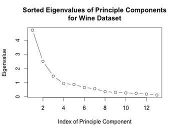
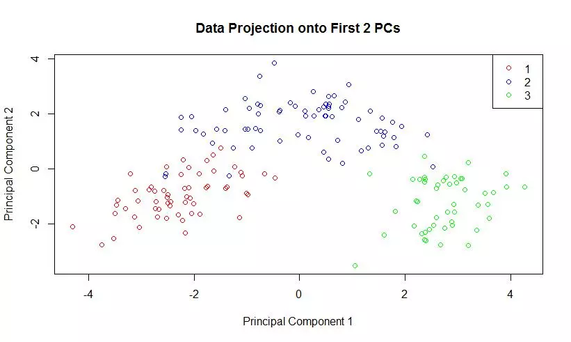
The eigenvalues of the covariance matrix were plotted in sorted order. The knee of the sorted eigenvalue plot would indicate that 3 principal components are enough to well represent the data. The first two principal components were computed, and the data was projected onto those components. A scatter plot of this two dimensional dataset was generated.
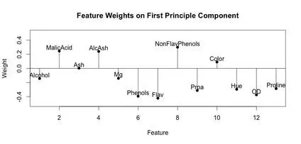
A stem plot was constructed for each of the first 3 principal components. This can help visualize which original components weight the principal components. The first principal component seems to be influenced/weighted by more components in total than the second and third principal components. In the second and third principal components, features 5-8, 10 and 11 seem to contribute less.


wine.df <- read.csv("wine.data",header=F);

wine.lab <- wine.df[,1]; #labels/classes
wine.feat <- wine.df[,-1]; #features

wine.pca <- prcomp(wine.feat, center = TRUE, scale. = TRUE)

plot((wine.pca$sdev)^2,type="b",main="Sorted Eigenvalues of Principle Components\nfor Wine Dataset",
     xlab="Index of Principle Component",ylab="Eigenvalue")

#matlab style stem plot, code adapted from:
#http://www.r-bloggers.com/matlab-style-stem-plot-with-r/
stem <- function(x,y,pch=16,linecol=1,clinecol=1,...){
  if (missing(y)){
    y = x
    x = 1:length(x) }
  #plot(x,y,pch=pch,ylim=c(-.5,.5),xlab="Feature",ylab="Weight",main="Feature Weights on First Principle Component",...)
  #plot(x,y,pch=pch,ylim=c(-.4,.8),xlab="Feature",ylab="Weight",main="Feature Weights on Second Principle Component",...)
  plot(x,y,pch=pch,ylim=c(-.4,.8),xlab="Feature",ylab="Weight",main="Feature Weights on Third Principle Component",...)
  for (i in 1:length(x)){
    lines(c(x[i],x[i]), c(0,y[i]),col=linecol)
  }
  lines(c(x[1]-2,x[length(x)]+2), c(0,0),col=clinecol)
}

#stem(wine.pca$rotation[,1])
#text(x=1:length(wine.pca$rotation[,1]),y=wine.pca$rotation[,1]+.05,labels=names(wine))

#stem(wine.pca$rotation[,2])
#text(x=1:length(wine.pca$rotation[,2]),y=wine.pca$rotation[,2]+.1,labels=names(wine))

stem(wine.pca$rotation[,3])
text(x=1:length(wine.pca$rotation[,3]),y=wine.pca$rotation[,3]+.1,labels=names(wine))


#retrieve the first 2 principal components
firstTwoPCs <- wine.pca$rotation[,1:2];
plot(pc$scores[,1],pc$scores[,2],pch=".");

#use a package to handle the projection of the data onto the first two principal components
pc = princomp(scale(wine.feat, center=TRUE,scale=TRUE),scores=T)
screeplot(pc,type="lines")

#M = pc$loading[,1:2]  #first two principal components
#t(M) %*% M   #check, make sure this equals the identity (2x2) matrix

#plot the data projected onto the first two principal components
plot(pc$scores[,1],pc$scores[,2],pch=".")

#create the same plot as above, but color the points by their class
#use wine.lab to decide the color for each of the 178 exs
DF <- data.frame(projDataPC1 = pc$scores[,1], projDataPC2 = pc$scores[,2], label = wine.lab);
attach(DF);
plot(projDataPC1, projDataPC2, col=c("red","blue","green")[label], xlab = "Principal Component 1", ylab = "Principal Component 2", main = "Data Projection onto First 2 PCs");
detach(DF);
legend(x ="topright", legend = c(1,2,3), col = c("red","blue","green"), pch=1);
Visualizing the Breast Cancer Diagnostic Dataset
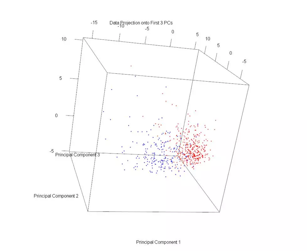
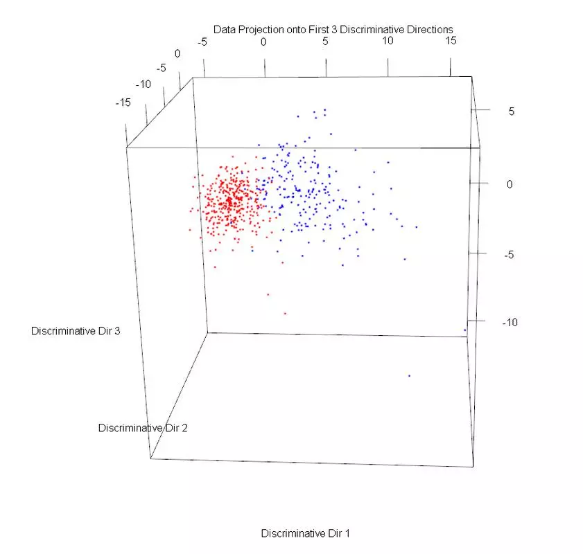
The dataset was plotted on the first three principal components, using different markers for benign and malignant cases. Then PLS1 was used to obtain three discriminative directions. The data was then projected onto those directions. The data in the PLS1 plot looks rather similar but with slightly better separation and not as much overlap.
wdbc.data <- read.csv("wdbc.data",header=F);
wdbc.id = wdbc.data[,c(1)];
wdbc.class = wdbc.data[,c(2)]
wdbc.feat = wdbc.data[,c(3:ncol(wdbc.data))]

#use a package to handle the projection of the data onto the first two principal components
wdbc.pc = princomp(scale(wdbc.feat, center=TRUE,scale=TRUE),scores=T)
#screeplot(wdbc.pc,type="lines")

#M = wdbc.pc$loading[,1:2]  #first two principal components
#t(M) %*% M   #check, make sure this equals the identity (2x2) matrix

#plot the data projected onto the first three principal components
#install.packages("rgl")
library(rgl)
plot3d(wdbc.pc$scores[,1],wdbc.pc$scores[,2], wdbc.pc$scores[,3])

#create the same plot as above, but color the points by their class
#use wdbc.lab to decide the color for each of the exs
DF <- data.frame(projDataPC1 = wdbc.pc$scores[,1], projDataPC2 = wdbc.pc$scores[,2], projDataPC3 = wdbc.pc$scores[,3], label = wdbc.class);

attach(DF);
plot3d(projDataPC1, projDataPC2, projDataPC3, col=c("red","blue")[label], xlab = "Principal Component 1", ylab = "Principal Component 2", zlab = "Principal Component 3", main = "Data Projection onto First 3 PCs");
detach(DF);

library('plsdepot')
wdbc.class.n <- as.numeric(wdbc.class)
colr<- c('red','green','blue','yellow','orange')
wdbc.class.col <- colr[wdbc.class.n]

pls1 = plsreg1(wdbc.feat,wdbc.class.n, comps = 3)

#we have 3 directions, so plot the projections along all 3
DF <- data.frame(projDataDir1 = pls1$x.scores[,c(1)], projDataDir2 = pls1$x.scores[,c(2)],projDataDir3 = pls1$x.scores[,c(3)], label = wdbc.class);
attach(DF);
plot3d(projDataDir1, projDataDir2, projDataDir3, col=c("red","blue")[label], xlab = "Discriminative Dir 1", ylab = "Discriminative Dir 2", zlab = "Discriminative Dir 3", main = "Data Projection onto First 3 Discriminative Directions");
detach(DF);


Comments